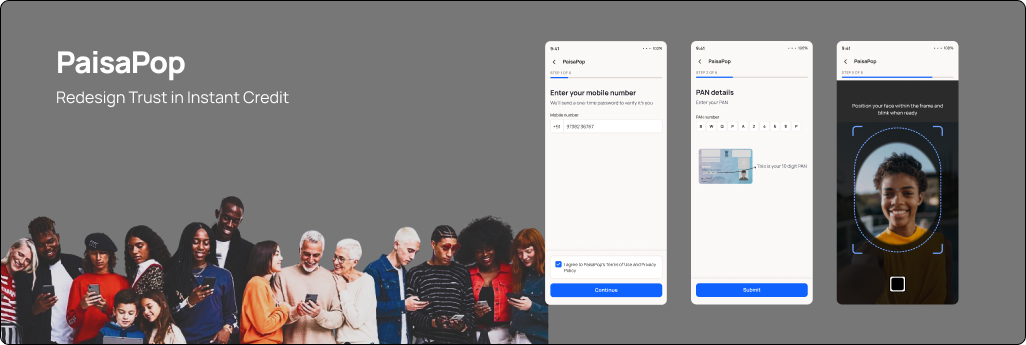
PaisaPop - Redesigning Trust in Instant Credit
End-to-end redesign of a fully digital payday-loan journey, from identity verification to disbursal.
CategoryFintech / Lending
ServicesUX/UI, Product Design
ClientPaisaPop
Year2026
Introduction
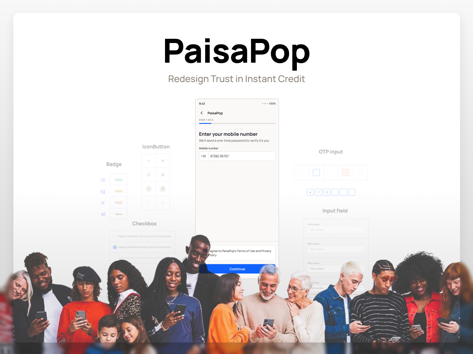
PaisaPop is a mobile-first payday-loan platform for salaried individuals in India who need short-term credit without the friction of traditional lending. As a progressive web app, it runs the entire borrowing journey - identity verification, application, approval, and disbursal - fully online, with no branch visits or paperwork.
The brief called for a fresh end-to-end interpretation of how a digital lending product should look, feel, and function: a visual language that builds trust in a category people are wary of, an interaction model that removes friction from a high-stakes flow, and a hierarchy that keeps critical decisions unmistakably clear at every step.
Overview
I was given the existing PaisaPop journey — screens covering mobile entry through disbursal — and asked to rethink both its design and experience. Before touching visuals, I needed to understand why each screen existed: what's legally required, what's industry standard, and what's just habit.
 View the complete original journey (PDF) →
Research & Competitor Study
I separated what's actually required by regulation from what PaisaPop does out of habit - reading the RBI's Digital Lending Directions, the KYC Master Direction, and the DPDP Act as primary text. Key finding: regulation requires a Key Fact Statement and an auditable consent record before loan execution; it does not require a spoken video pledge.
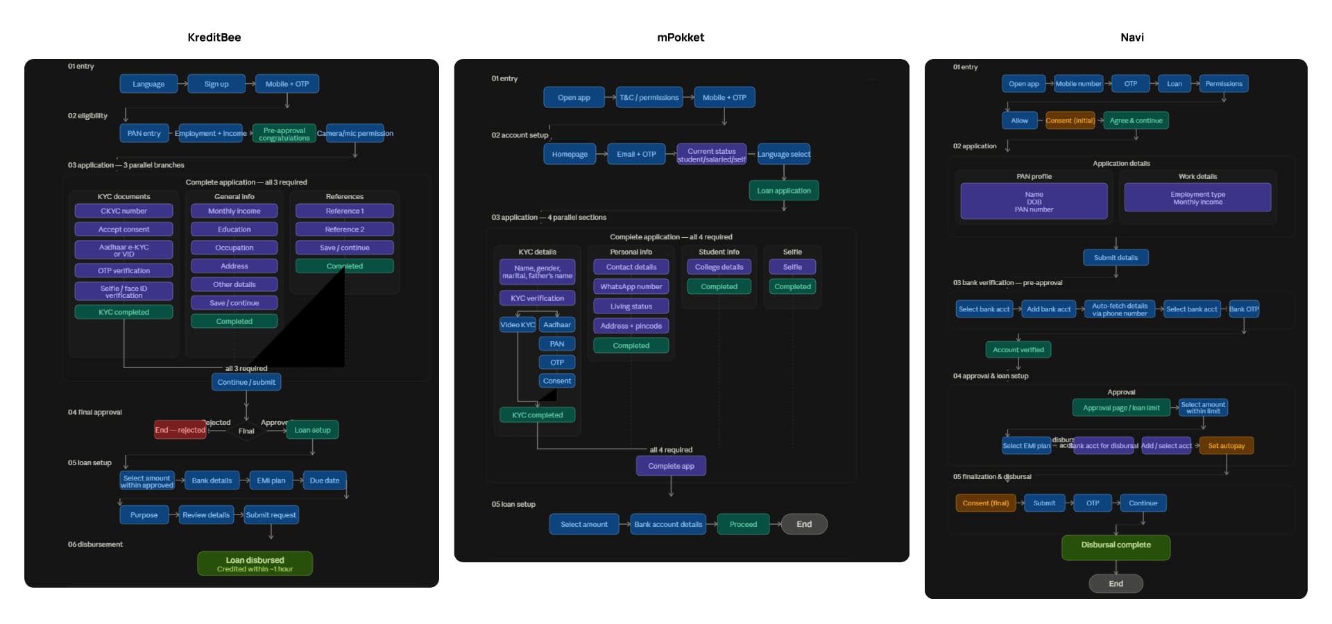
I then benchmarked three competitors - KreditBee, mPokket, and Navi. When AI-generated competitor flows proved unreliable, I rebuilt each flow screen-by-screen from step-by-step video walkthroughs and verified transcripts.
What this revealed
- No competitor uses a scripted video for consent - all three use a KFS plus OTP e-sign.
- No competitor requires address-proof upload by default - Aadhaar alone is treated as sufficient.
- Two of three offer OTP-based bank auto-fetch, eliminating manual entry for most users.
Redesigning the Flow
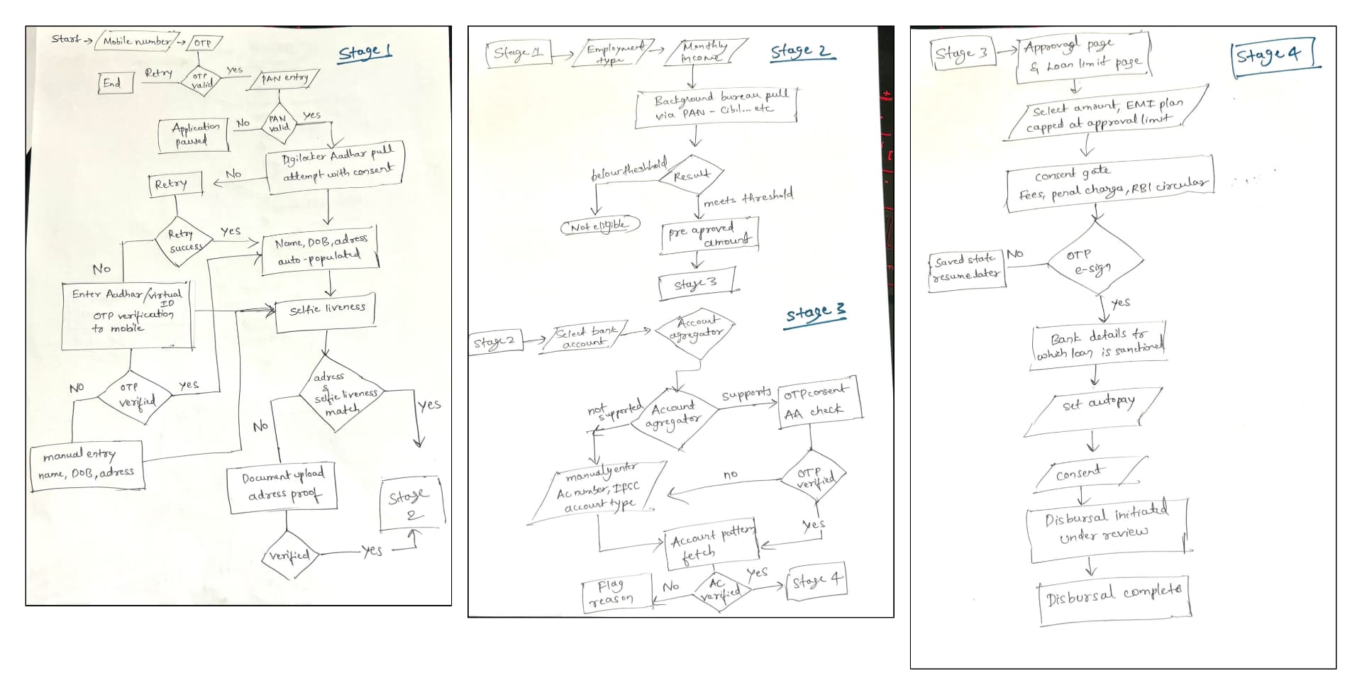
The core structural change was conditional logic. Rather than one linear path every user completes in full, the redesigned flow has two stages — employment verification and address proof — that appear only when an automated signal can't confirm the information on its own.
Six stages, two conditional
- Identity - DigiLocker-first Aadhaar verification with a three-tier fallback.
- Eligibility signal - employment type and income, then an automated bureau check.
- Bank linking - OTP-consented account auto-fetch, replacing manual entry.
- Employment detail (conditional) - only if bank data can't confirm declared income.
- Address proof (conditional) - only on an address/Aadhaar mismatch, with live stamp.
- Consent & disbursal - Key Fact Statement, OTP e-sign, and disbursal.
Low-Fidelity Wireframing
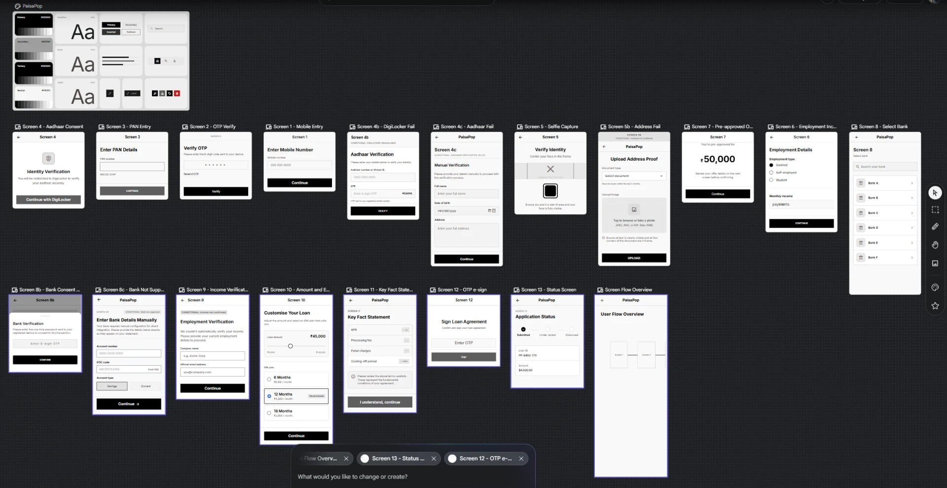
With the structure defined, I wireframed before any visual decisions — validating screen sequence and information grouping independent of type or color. I generated the initial set with Google Stitch, then assembled a clickable low-fi prototype in Figma to catch structural issues invisible in static frames.
 Low fidelity prototype →
Exploring the Visual Direction
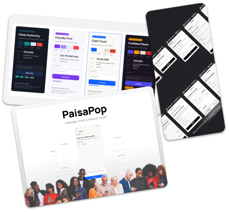
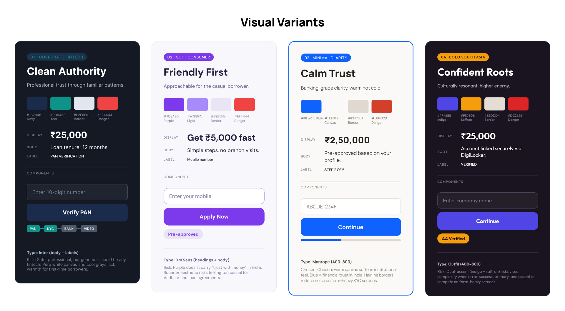
I built four distinct design-system variants — each with its own typeface, palette, and component styling — to test how each direction felt on real components. "Minimal Clarity" won: calm and trustworthy without being cold. A warm off-white canvas softens the institutional feel, a single primary blue keeps every action unambiguous, and flat surfaces with hairline borders keep dense KYC screens legible.
The Design System
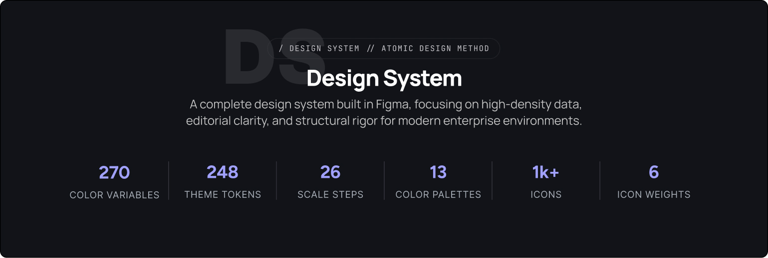
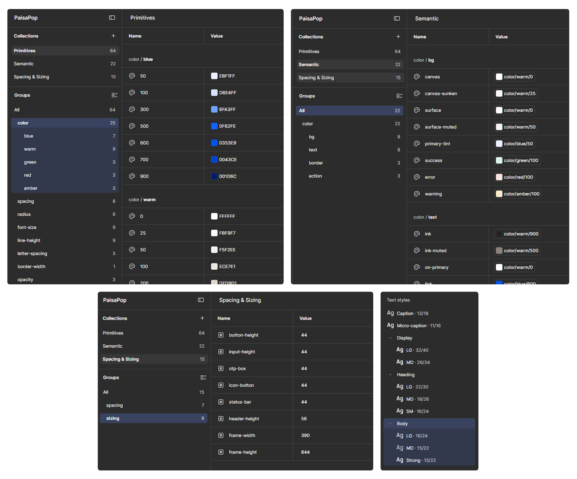
I built the system as a proper token architecture in Figma — 101 variables across three collections (Primitives, Semantic aliases, Spacing & Sizing), 10 text styles, and 3 effect styles. Every component references tokens directly, so one base change propagates through the whole library.
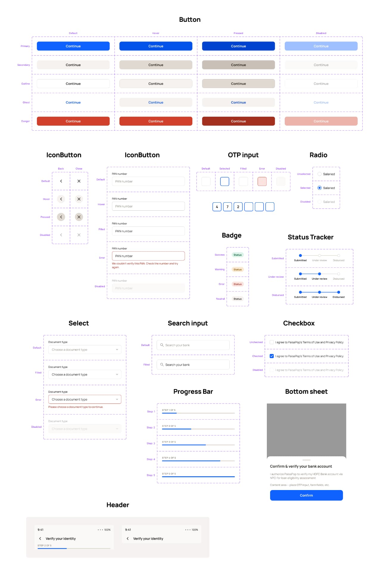
On that foundation I built a 15-component library with full variant coverage: buttons across 5 styles and 4 states, inputs with default/hover/filled/error/disabled, a purpose-built OTP input, radio and checkbox controls, status badges, a step progress indicator, and structural components — each built once, reused across all 21 screens.
Final Screens
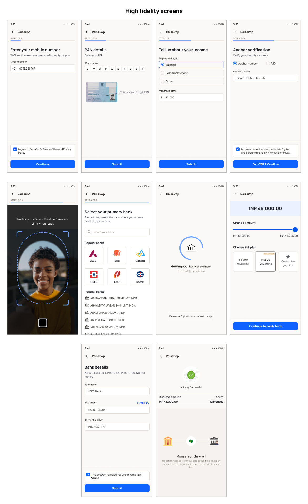
Once the library was complete, the high-fidelity screens came together quickly. Each screen is a composition of existing components — a Screen Header at the top, Input or Select instances in the content area, a Button pinned at the bottom. Nothing on any screen exists outside the component system.
Key Design Decisions
- Removed the scripted self-recorded video — not required by RBI, not used by any competitor, associated with predatory lending. Replaced with KFS + OTP e-sign: a stronger audit trail, done in seconds.
- Made address-proof upload conditional — Aadhaar already contains address data; upload triggers only on mismatch, preventing double-asking.
- OTP-based bank auto-fetch instead of manual entry — eliminates IFSC typos; one OTP yields both disbursal destination and salary-credit pattern.
- Conditional employment gate — bank-fetched salary credits already confirm income, so most salaried users skip it; when shown, 2 fields instead of 4.
Challenges & Solutions
- AI-generated competitor research was unreliable — solved by using video walkthroughs as the primary source and converting transcripts into verified flows.
- Separating legal requirement from habit — solved by reading primary RBI text and cross-referencing competitor implementations.
- Fallback tiers without complicating the happy path — each tier grows progressively more manual but converges at the same downstream step.
- Building a token system on Figma's free plan — restructured into three single-mode collections that still cascade from one primitive change.
Interactive prototype
Key screens linked through the complete journey: mobile entry → OTP → PAN → Aadhaar OTP → selfie → employment/income → pre-approved offer → bank selection → bank consent (bottom sheet) → amount/EMI selection → Key Fact Statement → OTP e-sign → disbursal status.
Interactive prototype →